

Fundamentals
Core
Master
Shaders
Image slider
In this lesson we will learn how to load and use texture images in our shaders to create this responsive image slider:
And here is the final result on mobile:
The project is inspired by this Codepen by Sikriti Dakua.
I hope you are motivated to learn how to create this effect, let's get started!
Starter project
Our starter project contains a fullscreen section containing a logo, a menu button and a <Canvas> component with a white cube in the middle of the scene.
We will be using Framer Motion to animate the HTML elements but you can use any other library or even plain CSS to animate them. We will only use the default version of Framer Motion, no need to install the 3D package.
For the UI I chose Tailwind CSS but feel free to use the solution you are most comfortable with.
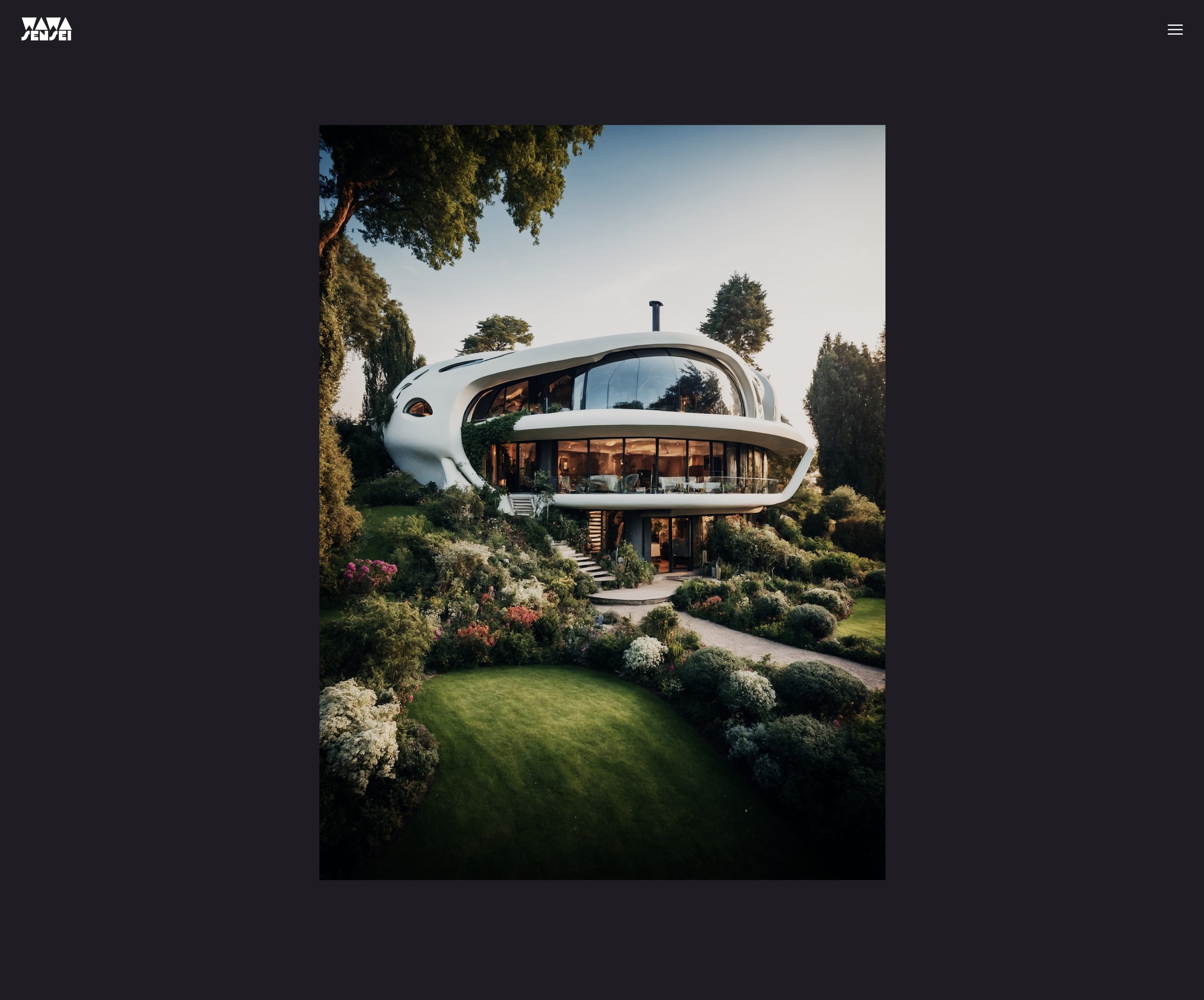
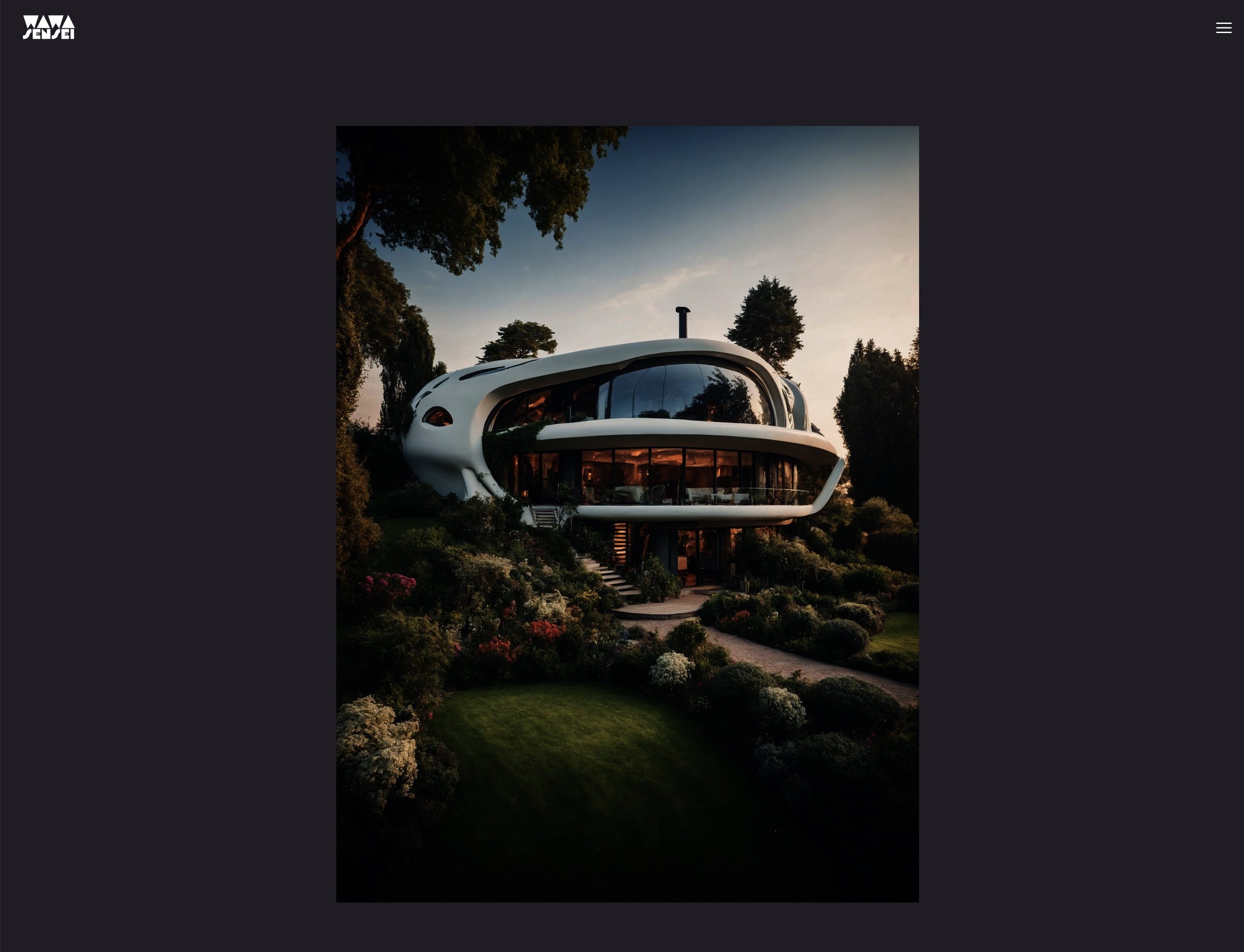
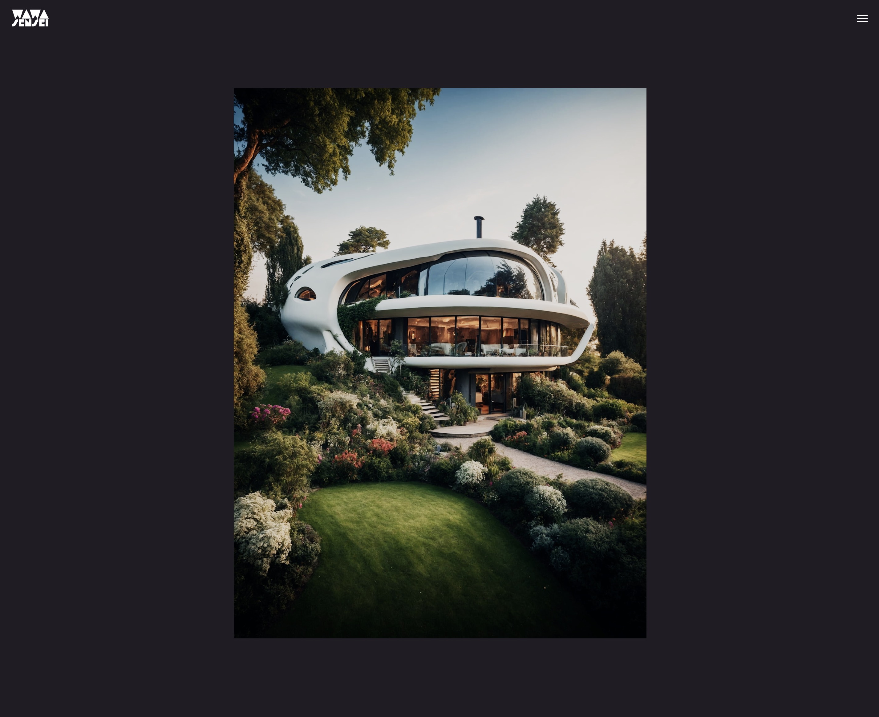
The public/textures/optimized folder contains the images we will use in the slider. I generated them using AI with Leonardo.Ai and optimized them with Squoosh. I chose a ratio of 3:4 to have a portrait orientation that will look good on mobile.
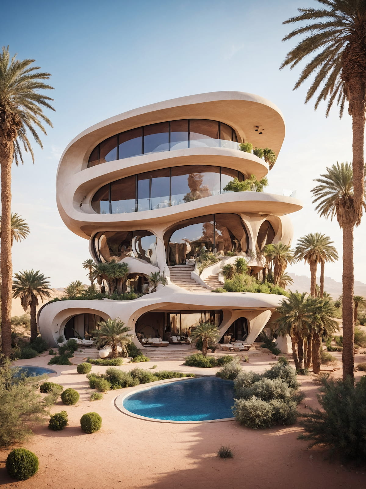
One of the images we will use optimized with Squoosh from 3.9mb to 311kb.
Image slider component
Let's start by replacing the white cube with a plane that will be used to display the images. We create a new component named ImageSlider:
export const ImageSlider = ({ width = 3, height = 4, fillPercent = 0.75 }) => { return ( <mesh> <planeGeometry args={[width, height]} /> <meshBasicMaterial color="white" /> </mesh> ); };
Ajust the width and height to the aspect ratio of the images you will use.
The fillPercent prop will be used to adjust the plane size to take only a percentage of the screen height/width.
In App.jsx we import the ImageSlider component and replace the white cube with it:
import { ImageSlider } from "./ImageSlider"; // ... function App() { return ( <> {/* ... */} <Canvas camera={{ position: [0, 0, 5], fov: 30 }}> <color attach="background" args={["#201d24"]} /> <ImageSlider /> </Canvas> {/* ... */} </> ); } // ...
And here is the result:
The plane is taking too much space
We want our plane to be responsive and to take only 75%(fillPercent) of the screen height. We can achieve this by using the useThree hook to get the viewport dimensions and creating a scale factor to adjust the plane size:
import { useThree } from "@react-three/fiber"; export const ImageSlider = ({ width = 3, height = 4, fillPercent = 0.75 }) => { const viewport = useThree((state) => state.viewport); const ratio = viewport.height / (height / fillPercent); return ( <mesh> <planeGeometry args={[width * ratio, height * ratio]} /> <meshBasicMaterial color="white" /> </mesh> ); };
To calculate our scale factor we divide the viewport.height by the height of the plane divided by fillPercent. This will give us a ratio that we can use to scale the plane.
To understand the math behind this, we can think of the
viewport.heightas the maximum height of the plane. If our viewport height is 3 and our plane height is 4, we need to scale the plane by3 / 4to make it fit the screen. But because we want to take only 75% of the screen height, we divide the plane height byfillPercentto get the new reference height. Which gives4 / 0.75 = 5.3333.
Then we multiply the width and height by the ratio to get the new dimensions.
It works nicely when we resize vertically but not horizontally. We need to adjust the plane width to take only 75% of the screen width when the viewport height is larger than the width.
import { useThree } from "@react-three/fiber"; export const ImageSlider = ({ width = 3, height = 4, fillPercent = 0.75 }) => { const viewport = useThree((state) => state.viewport); let ratio = viewport.height / (height / fillPercent); if (viewport.width < viewport.height) { ratio = viewport.width / (width / fillPercent); } return ( <mesh> <planeGeometry args={[width * ratio, height * ratio]} /> <meshBasicMaterial color="white" /> </mesh> ); };
Do not forget to change the ratio from const to let to be able to reassign it. (Or use a ternary operator instead)
Now the plane is responsive and takes only 75% of the screen height or width depending on the screen dimensions.
We are ready to display the images on the plane.
Custom shader image texture
First, let's load one of the images and display it on the current <meshBasicMaterial> using the useTexture hook from Drei:
import { useTexture } from "@react-three/drei"; // ... export const ImageSlider = ({ width = 3, height = 4, fillPercent = 0.75 }) => { const image = "textures/optimized/Default_authentic_futuristic_cottage_with_garden_outside_0.jpg"; const texture = useTexture(image); // ... return ( <mesh> <planeGeometry args={[width * ratio, height * ratio]} /> <meshBasicMaterial color="white" map={texture} /> </mesh> ); };
The image is nicely displayed on the plane.
Now, because we want to add creative effects during the transition between images and on hover, we will create a custom shader material to be able to display two images at the same time and to animate them.
ImageSliderMaterial
Let's create our custom shader material named ImageSliderMaterial. I chose to keep it in the same file as the ImageSlider component as it is tightly related to it. But you can create a separate file if you prefer.
// ... import { shaderMaterial } from "@react-three/drei"; import { extend } from "@react-three/fiber"; const ImageSliderMaterial = shaderMaterial( { uTexture: undefined, }, /*glsl*/ ` varying vec2 vUv; void main() { vUv = uv; gl_Position = projectionMatrix * modelViewMatrix * vec4(position, 1.0); }`, /*glsl*/ ` varying vec2 vUv; uniform sampler2D uTexture; void main() { vec2 uv = vUv; vec4 curTexture = texture2D(uTexture, vUv); gl_FragColor = curTexture; }` ); extend({ ImageSliderMaterial, }); // ...
We store our texture in a uniform named uTexture and we pass it to the fragment shader to display it.
The type of the uTexture uniform is sampler2D which is used to store 2D textures.
To extract the color of the texture at a specific position, we use the texture2D function and pass it the uTexture and the vUv coordinates.
Let's replace our meshBasicMaterial with our new ImageSliderMaterial:
// ... export const ImageSlider = ({ width = 3, height = 4, fillPercent = 0.75 }) => { // ... return ( <mesh> <planeGeometry args={[width * ratio, height * ratio]} /> <imageSliderMaterial uTexture={texture} /> </mesh> ); };
The image is displayed using our custom shader material.
Color grading
I know you start to have sharp eyes 🦅 and you noticed that the image color grading looks different!
This is because the <meshBasicMaterial/> does some extra processing inside the fragment shader to adjust the color based on the chosen tone mapping and color space on the renderer.
While this is something we could replicate manually in our custom shader, this is not the goal of this lesson and an advanced topic.
Instead, we can use ready-to-use fragments to enable the same effects as standard Three.js materials. If you look at the meshBasicMaterial source code, you will see that it's a mix of #include statements and custom code.
To make code easily reusable and maintainable, Three.js uses a preprocessor to include code from other files. Luckily, we can use those shader chunks in our custom shader material too!
Let's add those two lines at the end of our fragment shader:
void main() { // ... #include <tonemapping_fragment> #include <encodings_fragment> }
To understand better how the shader chunks work, this tool allows you to click on the include statements to see the code that is included: ycw.github.io/three-shaderlib-skim
The color grading is now the same as the meshBasicMaterial. 🎨
Before going further on the shader, let's prepare our UI.
Zustand State Management
Zustand is a small, fast and scalable state management library that allows us to create a global store to manage our application state.
It's an alternative to Redux or a custom context solution to share state between components and to manage complex state logic. (Even if it's not the case in our project. Our logic is simple.)
Let's add Zustand to our project:
yarn add zustand
And create a new file named useSlider.js in a hooks folder:
import { create } from "zustand"; export const useSlider = create((set) => ({}));
The create function takes a function as an argument that will receive a set function to update and merge the state for us. We can put our state and methods inside the returned object.
First the data we need:
// ... export const useSlider = create((set) => ({ curSlide: 0, direction: "start", items: [ { image: "textures/optimized/Default_authentic_futuristic_cottage_with_garden_outside_0.jpg", short: "PH", title: "Relax", description: "Enjoy your peace of mind.", color: "#201d24", }, { image: "textures/optimized/Default_balinese_futuristic_villa_with_garden_outside_jungle_0.jpg", short: "TK", title: "Breath", color: "#263a27", description: "Feel the nature surrounding you.", }, { image: "textures/optimized/Default_desert_arabic_futuristic_villa_with_garden_oasis_outsi_0.jpg", short: "OZ", title: "Travel", color: "#8b6d40", description: "Brave the unknown.", }, { image: "textures/optimized/Default_scandinavian_ice_futuristic_villa_with_garden_outside_0.jpg", short: "SK", title: "Calm", color: "#72a3ca", description: "Free your mind.", }, { image: "textures/optimized/Default_traditional_japanese_futuristic_villa_with_garden_outs_0.jpg", short: "AU", title: "Feel", color: "#c67e90", description: "Emotions and experiences.", }, ], }));
curSlidewill store the current slide index.directionwill store the direction of the transition.itemswill store the data of the slides. (path to the image, short name, title, background color and description)
Now we can create the methods to go to the previous and next slide:
// ... export const useSlider = create((set) => ({ // ... nextSlide: () => set((state) => ({ curSlide: (state.curSlide + 1) % state.items.length, direction: "next", })), prevSlide: () => set((state) => ({ curSlide: (state.curSlide - 1 + state.items.length) % state.items.length, direction: "prev", })), }));
The set function will merge the new state with the previous one. We use the modulo operator to loop back to the first slide when we reach the last one and vice versa.
Our state is ready, let's prepare our UI.
Slider UI
We will create a new component named Slider to display the slide text details and the navigation buttons. In Slider.jsx:
import { useSlider } from "./hooks/useSlider"; export const Slider = () => { const { curSlide, items, nextSlide, prevSlide } = useSlider(); return ( <div className="grid place-content-center h-full select-none overflow-hidden pointer-events-none relative z-10"> {/* MIDDLE CONTAINER */} <div className="h-auto w-screen aspect-square max-h-[75vh] md:w-auto md:h-[75vh] md:aspect-[3/4] relative max-w-[100vw]"> {/* TOP LEFT */} <div className="w-48 md:w-72 left-4 md:left-0 md:-translate-x-1/2 absolute -top-8 "> <h1 className="relative antialiased overflow-hidden font-display text-[5rem] h-[4rem] leading-[4rem] md:text-[11rem] md:h-[7rem] md:leading-[7rem] font-bold text-white block" > {items[curSlide].short} </h1> </div> {/* MIDDLE ARROWS */} <button className="absolute left-4 md:-left-14 top-1/2 -translate-y-1/2 pointer-events-auto" onClick={prevSlide} > <svg xmlns="http://www.w3.org/2000/svg" fill="none" viewBox="0 0 24 24" strokeWidth={1.5} stroke="currentColor" className="w-8 h-8 stroke-white hover:opacity-50 transition-opacity duration-300 ease-in-out" > <path strokeLinecap="round" strokeLinejoin="round" d="M10.5 19.5 3 12m0 0 7.5-7.5M3 12h18" /> </svg> </button> <button className="absolute right-4 md:-right-14 top-1/2 -translate-y-1/2 pointer-events-auto" onClick={nextSlide} > <svg xmlns="http://www.w3.org/2000/svg" fill="none" viewBox="0 0 24 24" strokeWidth={1.5} stroke="currentColor" className="w-8 h-8 stroke-white hover:opacity-50 transition-opacity duration-300 ease-in-out" > <path strokeLinecap="round" strokeLinejoin="round" d="M13.5 4.5 21 12m0 0-7.5 7.5M21 12H3" /> </svg> </button> {/* BOTTOM RIGHT */} <div className="absolute right-4 md:right-auto md:left-full md:-ml-20 bottom-8"> <h2 className="antialiased font-display font-bold text-transparent text-outline-0.5 block overflow-hidden relative w-[50vw] text-5xl h-16 md:text-8xl md:h-28" > {items[curSlide].title} </h2> </div> <div className="absolute right-4 md:right-auto md:left-full md:top-full md:-mt-10 bottom-8 md:bottom-auto"> <p className="text-white w-64 text-sm font-thin italic ml-4 relative"> {items[curSlide].description} </p> </div> </div> </div> ); };
We won't go through the details of the CSS used but let me explain you the main points:
- The middle container is a
divreproducing the dimensions and aspect ratio of our 3D plane. That way we can position the text and buttons relative to the plane. - We use
aspect-squareto keep the aspect ratio of the container. - The arrow buttons come from Heroicons.
- The title and short name have fixed dimensions and overflow hidden to create interesting text effects later on.
md:classes are used to adjust the layout on larger screens.
Let's add our Slider component next to the Canvas in App.jsx:
// ... import { Slider } from "./Slider"; function App() { return ( <> <main className="bg-black"> <section className="w-full h-screen relative"> {/* ... */} <Slider /> <Canvas camera={{ position: [0, 0, 5], fov: 30 }}> <color attach="background" args={["#201d24"]} /> <ImageSlider /> </Canvas> </section> {/* ... */} </main> </> ); } export default App;
The slider is displayed on before the canvas.
We need to change the style of the Canvas to be displayed as a background and to take the full screen width and height:
{/* ... */} <Canvas camera={{ position: [0, 0, 5], fov: 30 }} className="top-0 left-0" style={{ // Overriding the default style applied by R3F width: "100%", height: "100%", position: "absolute", }} > {/* ... */}
Let's add custom fonts and styles to our index.css:
@import url("https://fonts.googleapis.com/css2?family=Red+Rose:wght@700&display=swap&family=Poppins:ital,wght@1,100&display=swap"); @tailwind base; @tailwind components; @tailwind utilities; @layer base { .text-outline-px { -webkit-text-stroke: 1px white; } .text-outline-0\.5 { -webkit-text-stroke: 2px white; } .text-outline-1 { -webkit-text-stroke: 4px white; } }
The text-outline classes are used to create an outline around the text.
To add the custom fonts, we need to update our tailwind.config.js:
/** @type {import('tailwindcss').Config} */ export default { content: ["./index.html", "./src/**/*.{js,ts,jsx,tsx}"], theme: { extend: {}, fontFamily: { sans: ["Poppins", "sans-serif"], display: ["Red Rose", "sans-serif"], }, }, plugins: [], };
Now we have a nice looking UI:
Text effects
To make the transitions more interesting, we will add some text effects to the title, short name and description.
First, we need to get the direction to now if we are going to the next or previous slide. We can get it from the useSlider hook:
// ... export const Slider = () => { const { curSlide, items, nextSlide, prevSlide, direction } = useSlider(); // ... };
To be able to animate the previously displayed text out and the new text in, we need the index of the previous slide. We can calculate it easily:
// ... export const Slider = () => { // ... let prevIdx = direction === "next" ? curSlide - 1 : curSlide + 1; if (prevIdx === items.length) { prevIdx = 0; } else if (prevIdx === -1) { prevIdx = items.length - 1; } // ... };
Now we can add the text effects with the help of Framer Motion. Let's start with the title in the bottom right:
// ... import { motion } from "framer-motion"; const TEXT_TRANSITION_HEIGHT = 150; export const Slider = () => { // ... return ( <div className="grid place-content-center h-full select-none overflow-hidden pointer-events-none relative z-10"> {/* MIDDLE CONTAINER */} <div className="h-auto w-screen aspect-square max-h-[75vh] md:w-auto md:h-[75vh] md:aspect-[3/4] relative max-w-[100vw]"> {/* ... */} {/* BOTTOM RIGHT */} <div className="absolute right-4 md:right-auto md:left-full md:-ml-20 bottom-8"> <h2 className="antialiased font-display font-bold text-transparent text-outline-0.5 block overflow-hidden relative w-[50vw] text-5xl h-16 md:text-8xl md:h-28" > {items.map((item, idx) => ( <motion.div key={idx} className="absolute top-0 left-0 w-full text-right md:text-left" animate={ idx === curSlide ? "current" : idx === prevIdx ? "prev" : "next" } variants={{ current: { transition: { delay: 0.4, staggerChildren: 0.06, }, }, }} > {item.title.split("").map((char, idx) => ( <motion.span key={idx} className="inline-block" // to make the transform work (translateY) variants={{ current: { translateY: 0, transition: { duration: 0.8, from: direction === "prev" ? -TEXT_TRANSITION_HEIGHT : TEXT_TRANSITION_HEIGHT, type: "spring", bounce: 0.2, }, }, prev: { translateY: direction === "prev" ? TEXT_TRANSITION_HEIGHT : -TEXT_TRANSITION_HEIGHT, transition: { duration: 0.8, from: direction === "start" ? -TEXT_TRANSITION_HEIGHT : 0, }, }, next: { translateY: TEXT_TRANSITION_HEIGHT, transition: { from: TEXT_TRANSITION_HEIGHT, }, }, }} > {char} </motion.span> ))} </motion.div> ))} </h2> </div> {/* ... */} </div> </div> ); };
We use the animate prop to switch between the different states and we define the different properties for each state in the variants prop.
To animate each character, we split the title into an array of characters and we use the staggerChildren prop to delay the animation of each character.
The from prop is used to define the starting position of the animation.
Let's remove the overflow-hidden from the title to see the effect:
The title text is animated in and out.
Let's add the same effect to the short name:
// ... export const Slider = () => { // ... return ( <div className="grid place-content-center h-full select-none overflow-hidden pointer-events-none relative z-10"> {/* MIDDLE CONTAINER */} <div className="h-auto w-screen aspect-square max-h-[75vh] md:w-auto md:h-[75vh] md:aspect-[3/4] relative max-w-[100vw]"> {/* TOP LEFT */} <div className="w-48 md:w-72 left-4 md:left-0 md:-translate-x-1/2 absolute -top-8 "> <h1 className="relative antialiased overflow-hidden font-display text-[5rem] h-[4rem] leading-[4rem] md:text-[11rem] md:h-[7rem] md:leading-[7rem] font-bold text-white block" > {items.map((_item, idx) => ( <motion.span key={idx} className="absolute top-0 left-0 md:text-center w-full" animate={ idx === curSlide ? "current" : idx === prevIdx ? "prev" : "next" } variants={{ current: { translateY: 0, transition: { duration: 0.8, from: direction === "prev" ? -TEXT_TRANSITION_HEIGHT : TEXT_TRANSITION_HEIGHT, type: "spring", bounce: 0.2, delay: 0.4, }, }, prev: { translateY: direction === "prev" ? TEXT_TRANSITION_HEIGHT : -TEXT_TRANSITION_HEIGHT, transition: { type: "spring", bounce: 0.2, delay: 0.2, from: direction === "start" ? -TEXT_TRANSITION_HEIGHT : 0, }, }, next: { translateY: TEXT_TRANSITION_HEIGHT, transition: { from: TEXT_TRANSITION_HEIGHT, }, }, }} > {items[idx].short} </motion.span> ))} </h1> </div> {/* ... */} </div> </div> ); };
And a simple fade in and out effect for the description:
// ... export const Slider = () => { // ... return ( <div className="grid place-content-center h-full select-none overflow-hidden pointer-events-none relative z-10"> {/* MIDDLE CONTAINER */} <div className="h-auto w-screen aspect-square max-h-[75vh] md:w-auto md:h-[75vh] md:aspect-[3/4] relative max-w-[100vw]"> {/* ... */} {/* BOTTOM RIGHT */} {/* ... */} <div className="absolute right-4 md:right-auto md:left-full md:top-full md:-mt-10 bottom-8 md:bottom-auto"> <p className="text-white w-64 text-sm font-thin italic ml-4 relative"> {items.map((item, idx) => ( <motion.span key={idx} className="absolute top-0 left-0 w-full text-right md:text-left" animate={ idx === curSlide ? "current" : idx === prevIdx ? "prev" : "next" } initial={{ opacity: 0, }} variants={{ current: { opacity: 1, transition: { duration: 1.2, delay: 0.6, from: 0, }, }, }} > {item.description} </motion.span> ))} </p> </div> </div> </div> ); };
Our UI is now animated and ready to be used.
We are ready to jump into the most interesting part of this lesson: the shader transition effect! 🎉
Image transition effect
Like we did for animating the text, to do the transition between the images, we will need the current and previous image textures.
Let's store the previous image path in our ImageSlider component:
// ... import { useSlider } from "./hooks/useSlider"; import { useEffect, useState } from "react"; export const ImageSlider = ({ width = 3, height = 4, fillPercent = 0.75 }) => { const { items, curSlide } = useSlider(); const image = items[curSlide].image; const texture = useTexture(image); const [lastImage, setLastImage] = useState(image); const prevTexture = useTexture(lastImage); useEffect(() => { const newImage = image; return () => { setLastImage(newImage); }; }, [image]); // ... };
With the useEffect hook, we store the current image path in the lastImage state and when the image changes, we update the lastImage state with the new image path.
Before using the prevTexture in our shader, and before we forget, let's preload all the images to avoid flickering when we change the slide:
// ... export const ImageSlider = ({ width = 3, height = 4, fillPercent = 0.75 }) => { // ... }; useSlider.getState().items.forEach((item) => { useTexture.preload(item.image); });
By doing this, we are preloading all the images, we could safely add a loading screen at the beginning of our website to avoid any flickering.
Now, let's add two uniforms to our ImageSliderMaterial to store the previous texture and the progress of the transition:
// ... const ImageSliderMaterial = shaderMaterial( { uProgression: 1.0, uTexture: undefined, uPrevTexture: undefined, }, /*glsl*/ ` // ... `, /*glsl*/ ` varying vec2 vUv; uniform sampler2D uTexture; uniform sampler2D uPrevTexture; uniform float uProgression; void main() { vec2 uv = vUv; vec4 curTexture = texture2D(uTexture, vUv); vec4 prevTexture = texture2D(uPrevTexture, vUv); vec4 finalTexture = mix(prevTexture, curTexture, uProgression); gl_FragColor = finalTexture; #include <tonemapping_fragment> #include <encodings_fragment> }` ); // ... export const ImageSlider = ({ width = 3, height = 4, fillPercent = 0.75 }) => { // ... return ( <mesh> <planeGeometry args={[width * ratio, height * ratio]} /> <imageSliderMaterial uTexture={texture} uPrevTexture={prevTexture} uProgression={0.5} /> </mesh> ); };
We use the mix function to interpolate between the previous and current texture based on the uProgression uniform.
We can see a mix between the previous and current image.
Fade in and out effect
Let's animate the uProgression uniform to create a smooth transition between the images.
First, we need a reference to our material to be able to update the uProgression uniform:
// ... import { useRef } from "react"; export const ImageSlider = ({ width = 3, height = 4, fillPercent = 0.75 }) => { // ... const material = useRef(); // ... return ( <mesh> <planeGeometry args={[width * ratio, height * ratio]} /> <imageSliderMaterial ref={material} uTexture={texture} uPrevTexture={prevTexture} /> </mesh> ); };
We can get rid of the uProgression prop as we will update it manually.
Now in the useEffect when the image changes, we can set the uProgression to 0 and animate it to 1 in a useFrame loop:
// ... import { useFrame } from "@react-three/fiber"; import { MathUtils } from "three/src/math/MathUtils.js"; export const ImageSlider = ({ width = 3, height = 4, fillPercent = 0.75 }) => { // ... useEffect(() => { const newImage = image; material.current.uProgression = 0; return () => { setLastImage(newImage); }; }, [image]); useFrame(() => { material.current.uProgression = MathUtils.lerp( material.current.uProgression, 1, 0.05 ); }); // ... };
We now have a smooth transition between the images.
Let's build on top of this to create a more interesting effect.
Distorted position
To make the transition more interesting, we will push the images in the direction of the transition.
We will use the vUv coordinates to distort the position of the images. Let's add a uDistortion uniform to our ImageSliderMaterial and use it to distort the vUv coordinates:
End of lesson preview
To get access to the entire lesson, you need to purchase the course.